Apetit Oyj

Apetit operates in the growing plant-based food market. It manufactures and markets frozen vegetable and food products, as well as vegetable oil products for consumer and professional kitchen customers, as well as for the industry. Additionally, Apetit is actively involved in domestic and international grain markets.
The starting point for the Apetit.com and Apetit.fi website redesign projects
Hurja Solutions has been Apetit’s long-term partner in website implementations and redesign. In addition to website implementations, we have carried out various campaign sites in cooperation with advertising agencies around Apetit’s products.
Apetit.com website redesign for international export
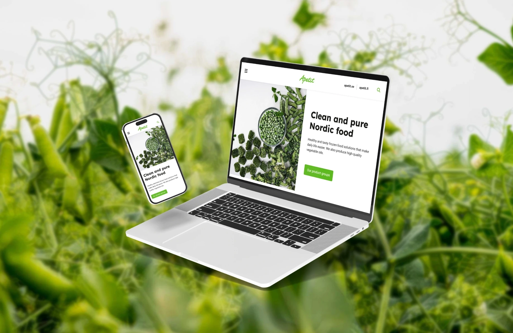
Our latest project with Apetit was the redesign of the apetit.com website, which is an English-language site focused on Apetit’s international export. The site’s imagery aimed to focus on genuine vegetable, food, and atmosphere pictures because, for example, private label customers purchase products from Apetit but use their own brand for marketing and selling the products.
The redesign aimed to simplify the existing site structure and clarify content to ensure users immediately understand the site’s purpose, target audience, and Apetit’s product groups.
The site also aimed to strongly highlight peas (Arctic peas), as they are one of Apetit’s key products. It was also crucial to emphasize sustainability and consider responsiveness, as more users now visit the site on mobile devices.
The new look of the site was intended to be fresh, simple, easy to navigate, and colorful. Additionally, it aimed to highlight professional people, such as Finnish food producers. Other keywords used in the design included airiness, summer, cleanliness, positivity, and deliciousness.
The imagery aimed to showcase the beautiful and pure Finnish nature, which is particularly interesting abroad with its Nordic exoticism. It was also essential that the vegetables appear bright and authentic.
Apetit.fi comprehensive website redesign for the brand’s main site
Hurja previously also carried out the redesign of the brand’s main site, apetit.fi. At that time, Apetit had four different sites for different target groups, and their maintenance and management were also distributed across various places.
The aim was to consolidate the sites so that all information would be clearly found at one address, and page management would take place through the same management interface.
High-quality implementation is the result of collaboration
Apetit.com website redesign for international export
The new site solution for apetit.com involved updating the appearance, structure, and content. The project began with Hurja analyzing the site to be redesign and other Apetit sites, gathering development suggestions for the site redesign.
The initial meeting discussed the client’s wishes, ideas, and identified development ideas. Apetit’s team was well-prepared for the website redesign, knowing exactly what they wanted, such as which content was unnecessary and what was problematic in the current appearance. The meeting also reviewed the client’s business, target groups, and key products, aiding in planning the site’s content, structure, and purpose more effectively.
After the meeting, Hurja’s UI/UX designer started working on the site’s visual design. Suitable images were selected from Apetit’s own image bank for the new look. The appearance was refreshed by discarding old dark images and text boxes, replacing them with light images to easily bring the right mood to the site. Positivity and colorfulness were brought to the site not only with images but also using Apetit’s own brand colors. Freshness was added by increasing white space between sections and using more white backgrounds. Deliciousness was easily highlighted using Apetit’s own image bank pictures, such as professional photos of vegetables and prepared dishes.
The homepage aimed to briefly present all essential information in order of importance, ensuring users easily find what they are looking for. The new pages were significantly simplified, removing all unnecessary content, allowing users to easily find contact information for sales, product categories, and certifications. The first visual design proposal was sent to the client’s team for review before the next meeting. The second meeting discussed the entire plan and contents, asking the client to choose the best option from the visual design proposals.
Apetit loved the plan, so after the meeting, we only made minor adjustments to the content layout, keeping the appearance the same.
The final adjustments were approved by the client, after which the site was coded. Images and text content were updated during coding as the client’s team finalized them.
Apetit.fi comprehensive website redesign for the brand’s main site
Years ago, during the apetit.fi site redesign, the contents for Apetit’s consumer customers, professional customers, and the group company Avena were added under one extensive site. Given the large amount of content, special attention was paid to ensuring the site didn’t become heavy or unclear from the user’s or admin’s perspective.
Several interfaces were made for the WordPress-based implementation, including to Apetit’s product information and recipe banks. The site’s internal search uses AddSearch functionalities.
The successful collaboration with Apetit has continued for years
In addition to website implementations, we have carried out several campaign sites in cooperation with advertising agencies around the company’s products. Due to the long-standing cooperation, various development projects to meet Apetit’s changing needs start quickly, as there have been many joint projects, allowing us to know each other’s ways of working and culture.
We also take care of the ongoing technical maintenance of Apetit’s apetit.fi and apetit.com sites. With the WordPress maintenance service, we keep the websites and their installed plugins technically up to date.
Maintaining separate development and production environments also ensures smooth continuous development according to Apetit’s changing needs. Various quick changes to the sites are also conveniently possible, as we already have access to manage the sites.
The apetit.com site redesign created websites that reflect the right spirit according to the client’s wishes, which are also easy to use from a maintenance perspective. The current look is, as desired, fresher, more summery, more cheerful, and more delicious.
The content feels logical, and essential information is easily found. The apetit.fi site redesign significantly eased content management compared to the previous multi-site solution.
The new site is also clearer for both retail customers and professional kitchen staff. Integrations with information banks speed up maintenance and automate site management.
We will also find the right solution for you when you need impressive and functional websites or experts for other online communication services, so feel free to contact us.
Shall we get started?
"*" indicates required fields


