
Online service not selling? See why with Microsoft Clarity
In a challenging market, sales do not necessarily stop all at once. Both website visitor numbers and conversions often begin to decline gradually. At the same time, competition intensifies, and users compare options more carefully than before.
The same phenomenon can also be seen in mobile applications: users quickly switch to another application if it feels slow, unclear or cumbersome to use. As competition intensifies, each visitor becomes more valuable, and even small differences in the service experience can influence the final decision.
The problem is not necessarily with the product, price or demand. The decisive factor is often how the user experiences the service compared to other alternatives. If the service feels unclear, slow or cumbersome, the user will switch to a service where the same task can be performed more smoothly. Such differences in experience are not always visible in traditional analytics.
To understand user experience, you need insight into how the service is actually used. Microsoft Clarity provides a concrete tool for this, and we will explain its benefits in this article.
- User experience drives sales generation
- Why gut feeling is not enough when developing user experience
- Microsoft Clarity makes the user experience visible
- What user data can reveal about barriers to sales
- From data to UX/UI changes
- How Microsoft Clarity revealed areas for improvement on our website
- Hurja’s Clarity assessment: a clear starting point for improving user experience
- User understanding as the starting point for development
User experience drives sales generation
Sales are not generated on a single page or in a single moment, but rather throughout the user’s entire experience. The user experience is determined by how easy, clear and natural the online service is to use from start to finish. The user journey helps to visualise this whole by describing where the user comes to the service from, what they are trying to achieve, what they see at different stages, and how the service meets their needs along the way.
In practice, it is rarely major individual errors that impair the user experience. More often, it is minor friction points along the user path: the next step is unclear, attention is directed to the wrong place, or essential information comes too late. Individually, these points may seem minor, but together they determine whether the user progresses towards their goal or abandons the task.
Why gut feeling is not enough when developing user experience
The user experience can be developed in many ways. Proven practices, previous experience and general principles often provide a good starting point, especially when user data is not yet available. These can be used to improve the structure, content and usability of the service in a controlled manner.
When user data is available, it adds a new dimension to development work. Data obtained from user research shows how users actually behave in a particular service and which aspects affect their progress. To understand this, Microsoft Clarity provides a practical view of user activity in the service.
Analysing user behaviour helps to supplement proven practices and focus UX/UI development on precisely those areas that are most important for the functionality and objectives of the service in question.
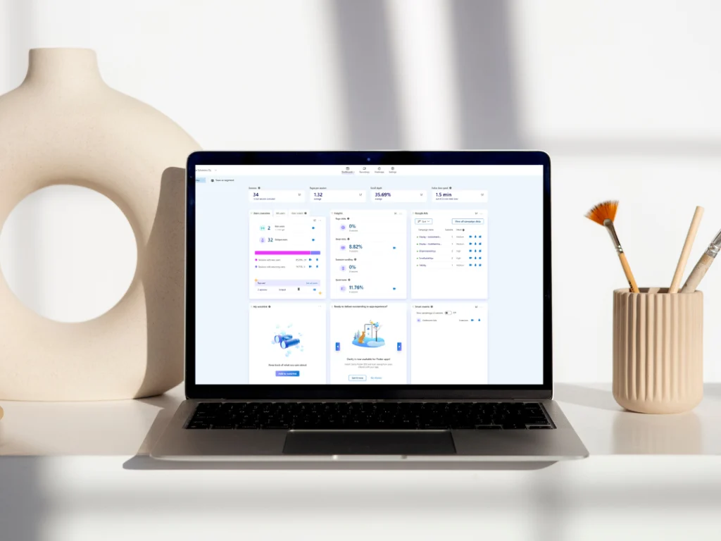
Microsoft Clarity makes the user experience visible
Microsoft Clarity is a free user behaviour analytics tool that reveals how digital services are actually used. It provides recordings and heat maps of users’ actual interactions with the service. Its strength lies in the fact that behaviour is shown concretely, not just in numbers. This often helps answer the question of why users do what they do, rather than just telling you what they do.
Clarity can be used to examine, for example:
- where users click and what they try to do
- how far the pages are scrolled
- where users go back or leave
- which points cause hesitation or confusion
This view complements traditional analytics and helps you understand where the user journey does not support decision-making.
Although Clarity is often used on websites and online stores, the same tool and approach also work in mobile applications. The user interface changes, but the user’s expectations of smoothness remain the same.
What user data can reveal about barriers to sales
User data can reveal a variety of problems:
- users cannot find the next step
- essential information arrives too late
- forms remain incomplete due to unclear fields
- mobile use is difficult
- users navigate back and forth between views
These are clear signs that the user path does not sufficiently support decision-making. And most importantly, these are things that can be influenced.
From data to UX/UI changes
Data alone does not solve anything. Benefits arise when observations are linked to the user path and converted into concrete development measures. Often, these are quite mundane matters: clarifying the structure, changing the emphasis, refining the text or improving mobile usability. When changes are based on actual use, their impact is easier to predict and measure.
In practice, this means that user data is used to make concrete changes to the user interface and user path. We don’t just identify where users drop out, we also outline what the corrected solution could look like.
This may involve, for example, structural changes to the purchase path, redesigning forms, rearranging emphases and content, or clarifying mobile use. If necessary, the changes are translated into visual wireframe models or UX/UI drafts, which make it easy to implement the corrections.
How Microsoft Clarity revealed areas for improvement on our website
We also utilise Microsoft Clarity in the development of our own websites. One concrete observation was a situation where users attempted to delve deeper into the content, but the link supporting their progress was missing. Users clicked on items where we had not noticed to add a link.
Without user research, this would have easily gone unnoticed. The pages worked correctly from a technical standpoint, and traditional analytics did not show any errors. However, with Clarity, we could clearly see the users’ intentions and where the experience broke down.
We use Clarity continuously to fine-tune our website. Small observations, such as unclear buttons, clicks in the wrong place, or content that is being used in a way other than intended, help us improve the overall experience step by step. It is precisely these details that determine whether a user will continue or leave the site.
Hurja’s Clarity assessment: a clear starting point for improving user experience
We utilise Microsoft Clarity continuously in our own work and offer the same approach to our customers’ services. This may mean, for example, a limited period of a few weeks, during which we examine the user experience based on actual use and identify the areas that should be addressed first in development work.
In practice, the work proceeds in stages:
- Microsoft Clarity is installed on the service
- agree on a suitable monitoring period, for example two weeks
- user data is analysed from key perspectives and paths
- findings and development proposals are reviewed together
The end result of the Clarity assessment is a clear view of what should be changed in the user experience and user path, and why. At this stage, the focus is on identifying observations and breaking them down into justified development proposals. Actual user interface changes or more detailed plans are not included in this stage.
If you wish to proceed with the findings, we can outline wireframe models, UX/UI drafts or more detailed plans after the assessment, which will make it easy to implement the changes. Any further action is always determined separately based on the findings of the survey.
The price for a Clarity assessment starts at €720 (VAT 0%), depending on the scope and objectives of the service being reviewed.
User understanding as the starting point for development
User research conducted with Microsoft Clarity reveals how the service is actually used and which details influence user progress. When the user experience is seen through actual use, development is based on observations rather than assumptions.
For us, user experience is part of the continuous development of the service, even after its launch. Digital services are never completely finished; they evolve with users, needs and operating methods. For example, the user insights generated by Clarity help us identify which changes to focus on and how to develop the service step by step.
If you would like to gain a clearer picture of how your service is used in everyday life and how it can be developed further, we would be happy to help you examine the big picture from this perspective.
Shall we get started?
"*" indicates required fields